
Biodiversity Maps: Transforming Data into Visual Tools into Meaningful Action for Biodiversity Conservation
Biodiversity Map Defined
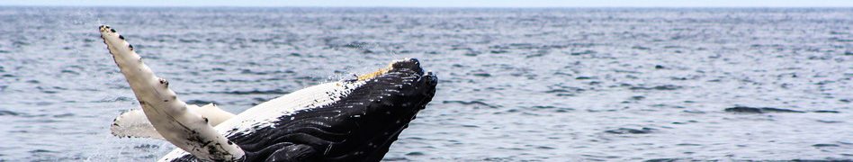
Biodiversity maps are a cartographic representation of any biodiversity data that have spatial and temporal units. The use of data mapping has become a vital component in biodiversity studies, management and conservation. Biodiversity maps allow visualization of data necessary for various analyses whether for current or future projection of various scenarios in biodiversity. They usually refer to mapping of species, populations or ecosystems, eyeing on their presence or count within an area at a specific time. They also illustrate the extent of impacts when variables relating to anthropogenic pressures are integrated with biodiversity data. Many biodiversity questions can be answered with the help of data mapping applications.
Maps easily convey biodiversity topics and concerns that have spatial implications. They can clearly communicate which biodiversity areas are in critical conditions and that require immediate attention for protection and conservation. Maps are very useful tool in identifying important locations for biodiversity agenda, especially when data collection requires collaborating with others. For instance, the study on a poisonous invasive weed called Giant Hogweed required public participation GIS (PPGIS) for monitoring of the geographic distribution of the species in Northeast Latvia. Contributors needed to submit point data to clearly identify the range of occurrence of the invasive weed that poses serious threat to both biodiversity and human health.

Maps display biodiversity information in graphical form, hence making it simple to understand than long textual descriptions. For example, this interactive map of Victoria, Australia directly shows its biodiversity and the habitat present in the region. The native vegetation, its inhabitants, their conservation status and the threats surrounding them are well implied, after ticking on the right map layer.
Transforming biodiversity information into maps and added with layers of other details also produce a dataset with specific locations through which monitoring schemes can be focused on. Studying the extent of species distribution and its changes through time, are key factors in evaluating the effectiveness of certain biodiversity strategies and pinpointing gaps in conservation. The Map of Life is a biodiversity mapping tool that depicts a huge collection of biodiversity data into maps through different search queries. You can search for a species and find its distribution across the globe, or search a location and find the species within that region, or, search based on biodiversity trends such as species data coverage, species habitat and species protection.


Why are biodiversity maps important?
Maps help reveal patterns in biodiversity useful in perceiving possible turn-of-events related to the challenges we currently face today, such as biodiversity loss, habitat degradation, alteration of species composition, etc. This information is critical in biodiversity assessments for us to gain knowledge on the status of our biodiversity and so we can deal with it accordingly. It could also be used to help us arrive at an intelligent estimation of the future, pointing to the likely directions of where our situation can bring us 5 or 10 or 20 years from now, if no change is to happen. From these scenarios, biodiversity managers come up with practical steps to break the status quo. We use biodiversity maps as reference points from which we take initial actions with the hope that ultimately we can achieve conservation and management of biodiversity resources.
Mapping also supports interpolation of the resulting data from integration of biodiversity data with other variables. That’s plotting biodiversity data with environmental and other relevant factors that may seem to show potential impacts to biodiversity. It is how marine scientists have determined that the big, top ocean predators have been overfished in global fisheries and consequently disrupted the food chain. As a result, the fishing industry shifted into catching the smaller species positioned at the bottom of the food chain. It’s a dangerous practice from which they predicted the fisheries collapse to happen soon.

Plotting Biodiversity Data Using GIS Software
In this post , we have learned how to download biodiversity data from open access biodiversity sources. Applying this data, we can use an open access GIS software to plot the species occurrence on a map. This will help us understand what Testudines (turtle) species are typically observed in Sydney, Australia and, how often people see them. Visualizing species distribution cues us whether they are found commonly or uncommonly within the region. We can use these insights to figure out what’s going on around the coasts of Sydney. We can study further whether the coasts are in good condition or not. For instance, the presence of these species can serve as indicators of the general ocean health in that area. Or, more studies may suggest that the coasts may have been too commercialized and justifies why there are a few sightings of such species. This biodiversity plot can be supplemented with other data, such as the presence of predators, or urban development activities within the area, and be used to infer the potential impacts to coastal organisms, such as the Testudines, in this case. Here’s the map of the biodiversity data created using QGIS.


Conclusion
With the use of open access data and open source softwares, biodiversity researchers and practitioners can now freely create biodiversity maps and, perform relevant data analyses, as much as possible and as creative as they can be. Species data can be plotted with other relevant data available. The more data are used for analysis, the more in-depth inferences can be made. We can arrive at better answers to the myriad of questions and challenges about biodiversity. This should help us come up with wiser decisions for policies and conservation actions. With visualization, comes understanding, and comes action. The more creative we can be to use the available data and show their meaning through visual tools such as biodiversity maps, the more people can be engaged in action.
Are you working on any type of biodiversity data? Have you tried to work with maps using any GIS mapping software? Challenge yourself by doing any spatial-related analysis, there is surely something new to discover about your data. Think about how we can use your findings to manage and conserve biodiversity.
“The application of GIS is limited only by the imagination of those who use it”. Jack Dangermond, Environmental Systems Research Institute (ESRI)
References:
1GBIF.org (22nd November 2016) GBIF Occurrence Download. Testudines of Sydney Dataset. doi:10.15468/dl.0ryqgq
Resources:
How to Use QGIS (QGIS Manual)
If you’re interested in free online training by GIS experts, you can check the MOOC.